
When it comes to building a memorable brand, few creative decisions carry as much weight as your logo. Among the many styles available today, the types of illustration logo design stand out for their ability to communicate personality, story, and values — all in a single visual mark. Whether you run a boutique coffee shop, a tech startup, or a creative agency, illustration-based logos give your brand a human touch that flat icons and wordmarks simply cannot replicate. In this complete guide, we walk you through every major illustration logo style, explain how each one works, and help you decide which direction suits your brand identity best.
What Makes Illustration Logos Different from Other Logo Styles?
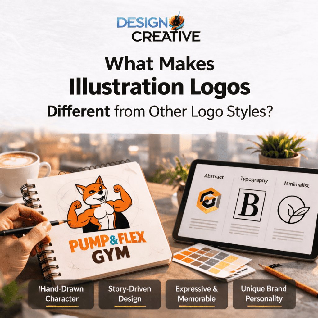
Before diving into the specific styles, it helps to understand what sets illustration logos apart. Traditional logos often rely on typography, abstract shapes, or simple icons. Illustration logos, on the other hand, incorporate hand-drawn or digitally rendered artwork that brings a narrative quality to your brand mark.
This storytelling dimension makes illustration logos particularly powerful for brands that want to express creativity, craftsmanship, authenticity, or heritage. They work across industries — from food and beverage to fashion, from children’s products to professional services. The key lies in choosing the right illustration style that aligns with your brand values and target audience.
Types of Illustration Logo Design: A Complete Breakdown
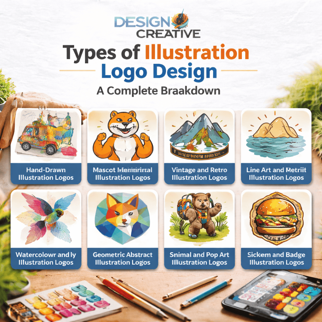
Now, let’s delve into the core of this guide. Below, you will find each major illustration logo style explained in detail — what it looks like, how it feels, and which types of brands benefit most from it.
1. Hand-Drawn Illustration Logos
Hand-drawn logos are exactly what they sound like: artwork that is created with physical or digital drawing tools to mimic the feel of a genuine sketch or painting. These logos feel warm, personal, and artisanal, which makes them a favourite among independent businesses.
Best suited for: bakeries, craft breweries, artisan food brands, boutique shops, and wellness businesses.
The charm of hand-drawn logos comes from their imperfections. A slightly uneven line or a brushstroke texture signals to your audience that a real human being invested care into creating your brand. This immediately builds trust and emotional connection.
When you work with a professional design studio, hand-drawn logos can be digitized and refined so they reproduce perfectly across all formats — from business cards to billboards — without losing that organic feel.
2. Mascot Illustration Logos
Mascot logos feature a defined character — a person, animal, or fantastical creature — that acts as the face of the brand. Think of iconic brand mascots that have become inseparable from the companies they represent.
Best suited for: sports teams, food brands, educational platforms, children’s businesses, and entertainment companies.
Mascots are powerful because they give your brand a personality that audiences can relate to and root for. A well-designed mascot creates an emotional shortcut — your customer does not just see a logo; they see a friend. Over time, mascots build brand loyalty that is incredibly difficult to break.
If you want to explore how a custom mascot could represent your business, visit our logo design services page to see how we approach character-based branding.
3. Vintage and Retro Illustration Logos
Vintage logos draw on design aesthetics from specific historical eras — the 1920s Art Deco style, the bold americana of the 1950s, or the psychedelic energy of the 1970s. They use detailed cross-hatching, classic badge shapes, muted colour palettes, and weathered textures to evoke a sense of history and craftsmanship.
Best suited for: craft beverages, barbershops, heritage fashion brands, motorcycle clubs, diners, and any business that wants to position itself as time-tested and trustworthy.
The psychological impact of a vintage illustration logo is significant. When customers see retro design elements, they subconsciously associate your brand with longevity and proven quality — even if your business is relatively new. This is a clever way to borrow credibility from the past.
4. Line Art and Minimalist Illustration Logos
Line art logos use clean, precise strokes to create illustrations with no fills or very limited colour. The result is an elegant, sophisticated visual that feels modern and refined. This style is often called ‘outline’ or ‘contour’ illustration.
Best suited for: luxury brands, architecture firms, beauty and skincare businesses, law firms, and any brand targeting a premium, design-savvy audience.
One of the biggest practical advantages of line art logos is their scalability. Because they rely on clean strokes rather than complex colour fills or gradients, they reproduce beautifully at any size — from a tiny app icon to a large-format printed banner.
Our team at Designo Creatives specializes in clean, versatile line art logos that work seamlessly across both digital and print applications.
5. Watercolour and Painterly Illustration Logos
Watercolour logos use soft, flowing washes of colour that bleed and blend in organic, unpredictable ways. They carry a dreamy, artistic, and feminine energy that sets them apart from the crisp lines of other logo styles.
Best suited for: wedding planners, photographers, florists, yoga studios, lifestyle brands, and creative agencies.
The delicate layering of translucent colours in a watercolour logo communicates sensitivity, creativity, and artistry. However, this style requires expert handling—poorly executed watercolour logos can look muddy or unprofessional. When done well, though, they are some of the most striking and memorable brand marks in any industry.
6. Geometric and Abstract Illustration Logos
Geometric illustration logos use shapes—circles, triangles, hexagons, or grids— to form images or patterns with a structured, mathematical precision. These logos sit somewhere between pure abstract marks and representational illustration.
Best suited for: technology companies, financial services, architecture, engineering firms, and forward-thinking startups.
Geometric logos communicate order, logic, innovation, and reliability. The precision of the shapes suggests that your business operates with the same level of accuracy and attention to detail. They also tend to be highly adaptable across branding materials, from app icons to printed reports.
7. Animal and Nature-Inspired Illustration Logos
Many of the world’s most recognizable logos feature animals — from the Twitter bird to the WWF panda. Animal illustration logos leverage the symbolic associations that specific creatures carry in popular culture. A wolf suggests strength and loyalty; a fox signals cleverness; an owl represents wisdom.
Best suited for: outdoor brands, conservation organizations, pet businesses, sports teams, fitness brands, and eco-friendly companies.
Nature-inspired logos that incorporate plants, mountains, waves, or sun motifs work particularly well for wellness, travel, and sustainability-focused brands. These visual metaphors quickly communicate what your brand stands for without the need for words.
8. Sticker and Pop Art Illustration Logos
Sticker-style logos are bold, outlined illustrations with bright, flat colours that look as though they were designed to be printed on a sticker. Pop art logos take inspiration from the bold, graphic styles of the 1960s art movement, featuring high-contrast visuals and strong outlines.
Best suited for: streetwear brands, youth-oriented products, music groups, gaming companies, and businesses targeting Gen Z and millennial audiences.
These logos are designed to be fun and attention-grabbing. They perform exceptionally well on social media platforms, merchandise, and packaging — wherever you need to stop a scroll or catch an eye in a busy retail environment.
9. Emblem and Badge Illustration Logos
Emblem logos combine typography with detailed illustration work inside a badge, crest, or seal shape. They feel official, authoritative, and prestigious — which is why schools, government bodies, and heritage brands have used them for centuries.
Best suited for: schools and universities, sports clubs, premium food and beverage brands, law firms, and any organization that wants to communicate authority and tradition.
Modern emblem logos update this classic format with contemporary illustration techniques, making them feel both timeless and relevant. They work especially well for businesses that want to communicate heritage and trustworthiness to a discerning customer base.
How to Choose the Right Illustration Logo Style for Your Brand
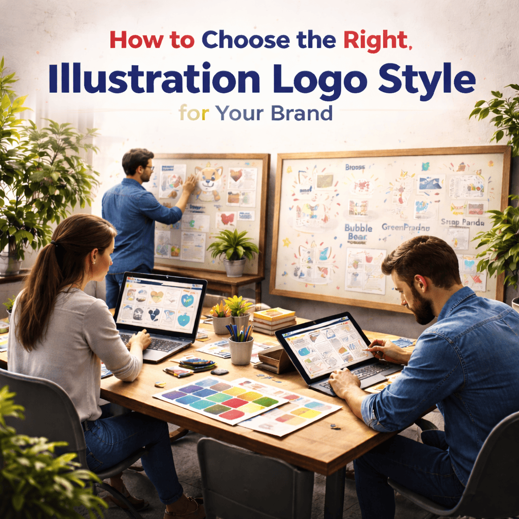
With so many compelling options available, choosing the right illustration logo style can feel overwhelming. Here is a simple framework to guide your decision:
- Define your brand personality first. Ask yourself: Is your brand playful or serious? Luxurious or accessible? Traditional or cutting-edge? Your answers will immediately narrow down your options.
- Know your target audience. A logo that resonates with a 25-year-old sneaker enthusiast looks very different from one that appeals to a 50-year-old financial planning client.
- Consider your industry. Some illustration styles carry strong sector associations. A watercolour logo in a law firm setting would feel out of place, just as a geometric abstract mark would feel cold for a children’s daycare.
- Think about applications. Where will your logo appear most? If embroidery or small-scale printing is important, intricate watercolour details won’t work well. Simpler line art or geometric styles offer better versatility.
- Look at your competitors, then differentiate. Study what illustration styles are common in your industry, and find a way to stand out visually while still feeling appropriate for your market.
Our creative team at Designo Creatives guides clients through exactly this discovery process before a single illustration stroke is made. We believe the best logos start with strategy, not aesthetics.
The Role of Colour and Typography in Illustration Logo Design
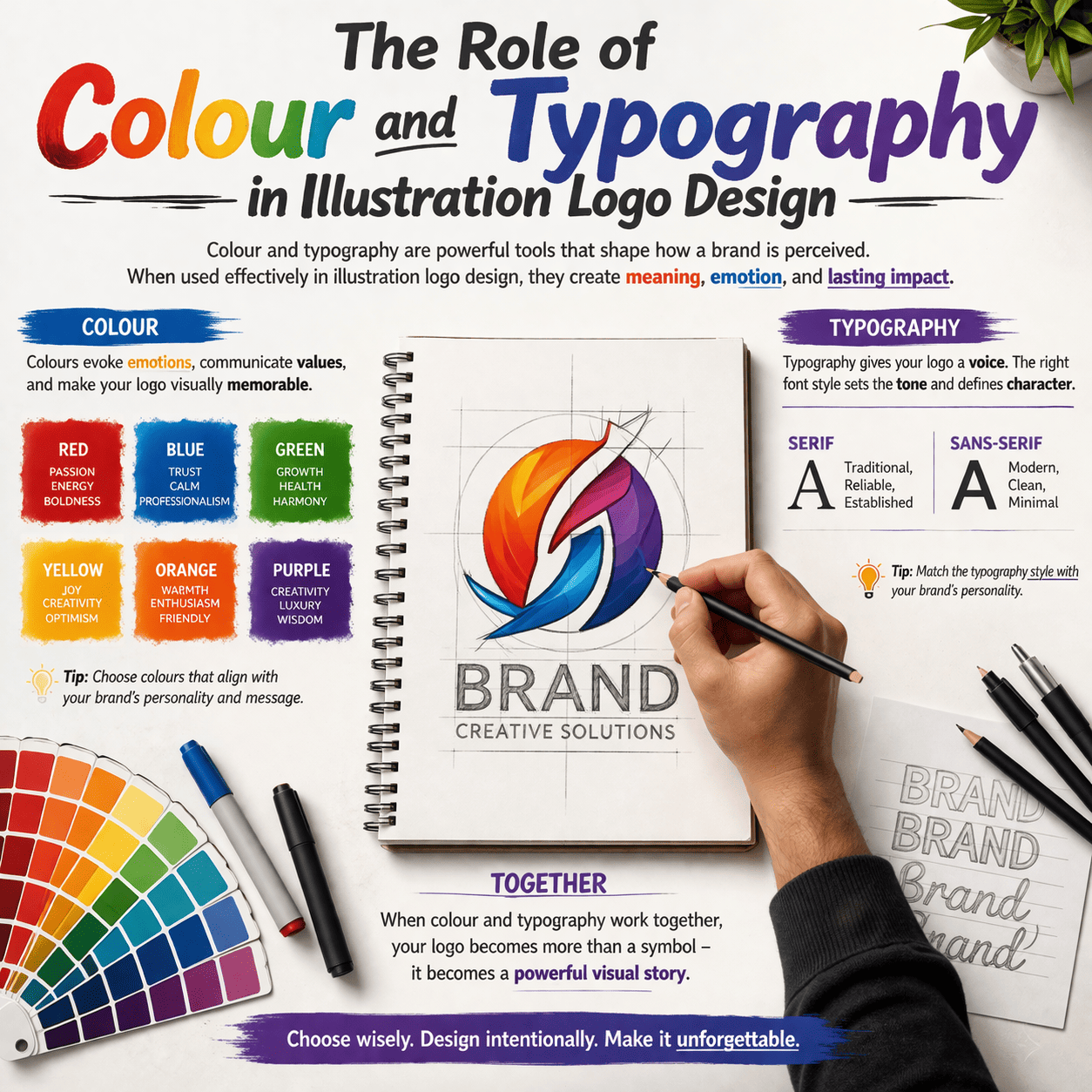
Even the most beautifully crafted illustration logo will fall flat if the wrong colours or typefaces accompany it. Colour psychology plays a crucial role in how customers perceive and remember your brand.
Warm tones (reds, oranges, yellows) create energy, urgency, and appetite, hence their popularity in food and retail. Cool tones (blues, greens, purples) communicate calm, trust, and sophistication, making them effective for finance, healthcare, and tech brands. Earth tones (browns, tans, muted greens) suggest organic quality and sustainability.
Typography choices matter just as much. A hand-drawn logo paired with a serif typeface reads as classic and authoritative. The same illustration with a rounded sans-serif font feels friendly and approachable. These combinations are deliberate decisions that shape how audiences experience your brand at every touchpoint.
Why Professional Illustration Logo Design Is Worth the Investment
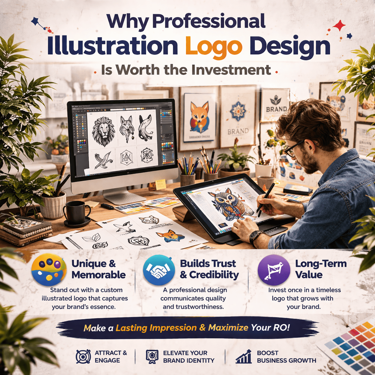
In the age of logo generators and template marketplaces, it is tempting to cut corners on branding. However, a generic or poorly crafted logo can actively harm your business, communicating that you do not take your own brand seriously enough to invest in it.
Professional illustration logo design delivers several benefits that DIY tools simply cannot replicate:
- Strategic alignment: a professional designer researches your brand, audience, and competitors before creating anything.
- Technical quality: professionally delivered logos come in all necessary file formats, ensuring perfect reproduction across every application.
- Uniqueness: custom illustration logos are original artworks, unlike template-based marks that may be used by hundreds of other businesses.
- Scalability: from a tiny social media profile picture to a large outdoor banner, a well-crafted illustration logo stays sharp and impactful at every size.
- Long-term value: a strong logo becomes an asset that appreciates over time as your brand recognition grows.
illustration logo design services combine artistic talent with strategic thinking to deliver brand marks that work hard for your business — today and for years to come.
Types of Illustration Logo Design Across Different Industries
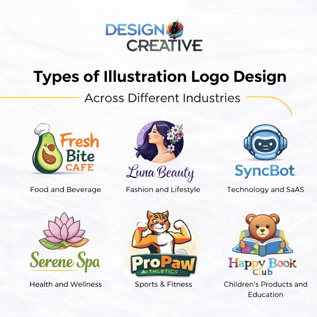
To make this guide even more practical, here is a quick reference for how different industries typically approach illustration logo design:
Food and Beverage: Hand-drawn, vintage badge, and mascot logos dominate this space. Think of artisan coffee shops with detailed botanical drawings or craft breweries with character-rich animal mascots.
Fashion and Lifestyle: Line art, minimalist illustrations, and watercolour styles are popular here, communicating refinement and creative taste.
Technology and SaaS: Geometric illustration and abstract marks convey innovation, precision, and forward-thinking values.
Health and Wellness: Nature-inspired illustrations, watercolours, and soft lines communicate calm, care, and holistic thinking.
Sports and Fitness: Bold mascot logos, dynamic animal illustrations, and emblem-style marks communicate strength, competition, and team spirit.
Children’s Products and Education: Playful hand-drawn characters, bright sticker-style art, and friendly mascots make brands approachable and fun for young audiences.
Current Trends in Illustration Logo Design
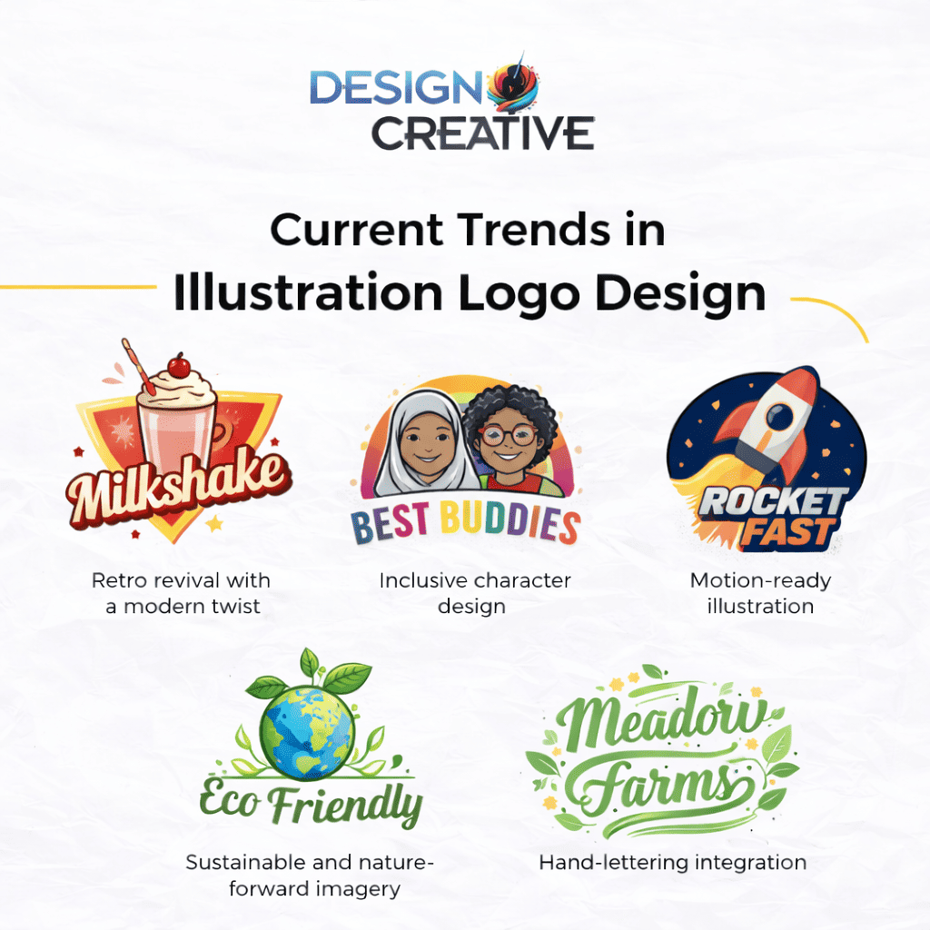
The world of brand illustration is constantly evolving. Here are the trends that leading designers and forward-thinking brands are embracing right now:
- Retro revival with a modern twist: Brands are drawing from vintage aesthetics but using contemporary colour palettes and cleaner execution to feel nostalgic yet fresh.
- Inclusive character design: Mascots and character-based logos increasingly reflect diverse representation, ensuring all customers see themselves in the brand.
- Motion-ready illustration: As digital touchpoints multiply, brands are commissioning illustration logos that can be animated for social media, websites, and app interfaces.
- Sustainable and nature-forward imagery: With environmental consciousness at an all-time high, botanicals, wildlife, and earth-based motifs are appearing across brand identities in every industry.
- Hand-lettering integration: Combining custom lettering with illustration creates cohesive, one-of-a-kind logos where the typography itself becomes part of the artwork.
Conclusion
Choosing the right visual identity is one of the most consequential decisions you will make for your business. As this guide demonstrates, the types of illustration logo design available today span a remarkable range — from delicate watercolour washes to bold mascot characters, from clean line art to intricate vintage emblems. Each style carries its own emotional language, practical strengths, and ideal use cases.
The best approach is to start with strategy: understand your brand personality, your audience, and the impression you want to leave in every customer interaction. From there, the right illustration style becomes much clearer.
Ready to bring your brand vision to life? Explore our full range of creative services at Designo Creatives, where our team of skilled illustrators and brand strategists is ready to design a logo that tells your story beautifully — and memorably.